Creative Quarterly 2021, Honorable Mention
Packaging | Branding
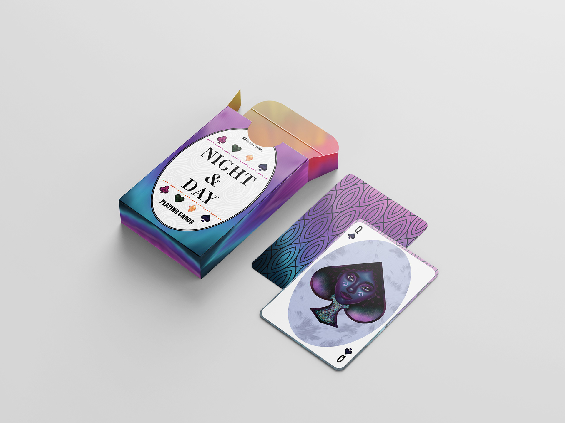
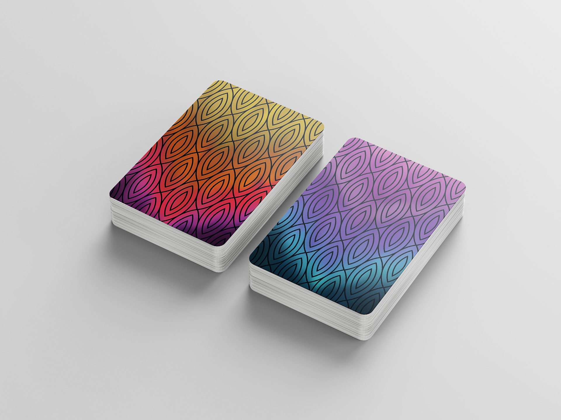
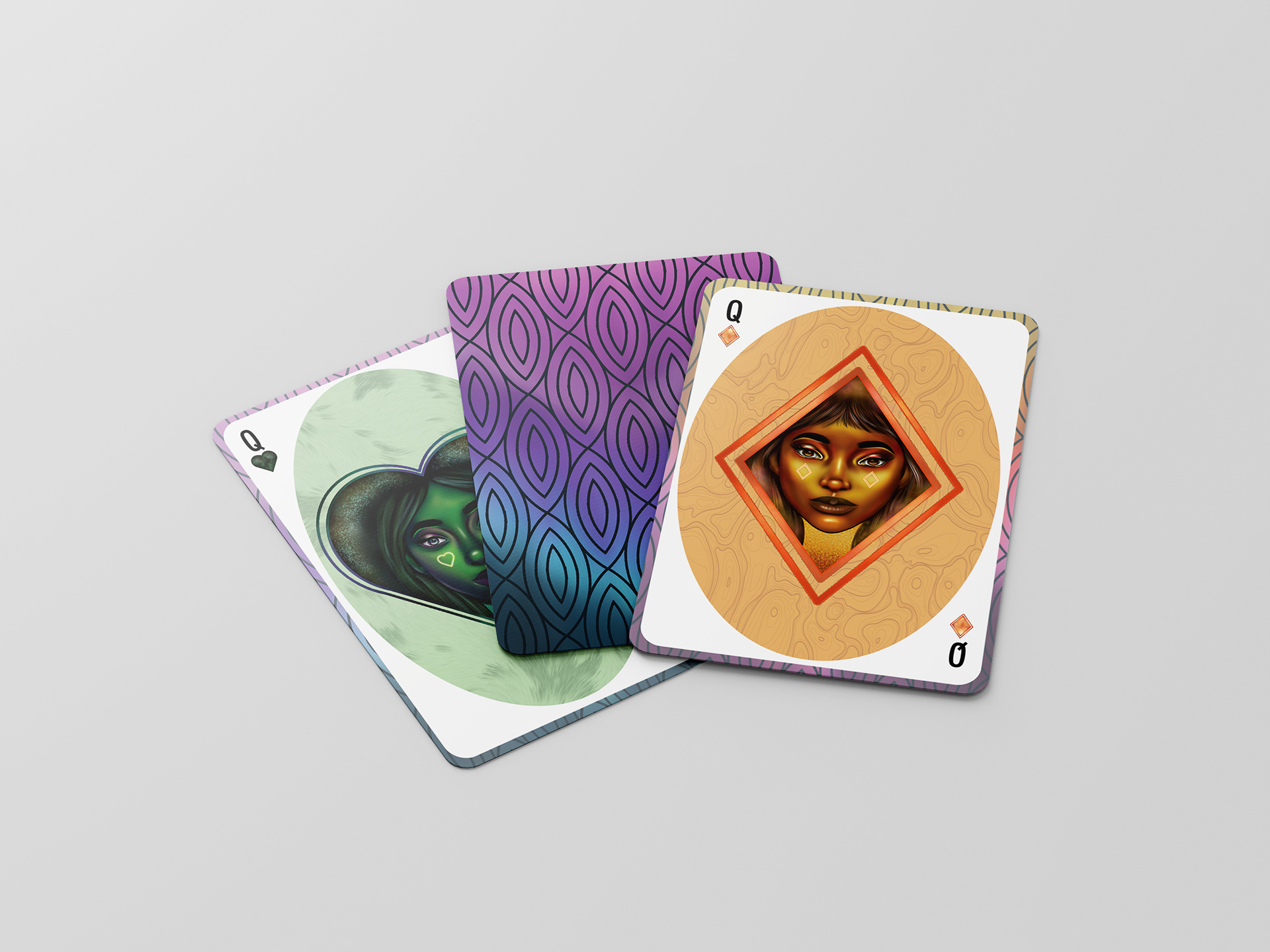
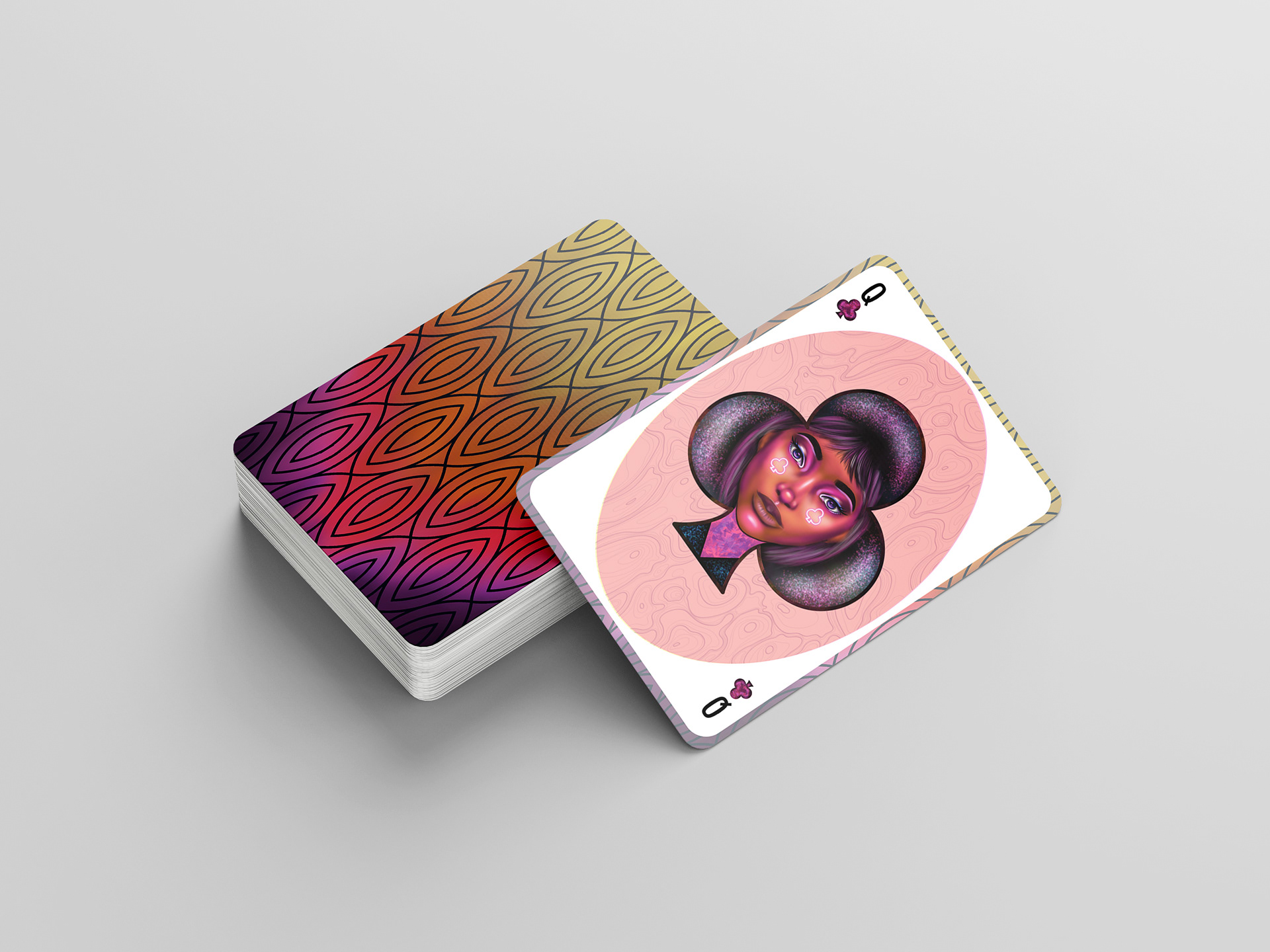
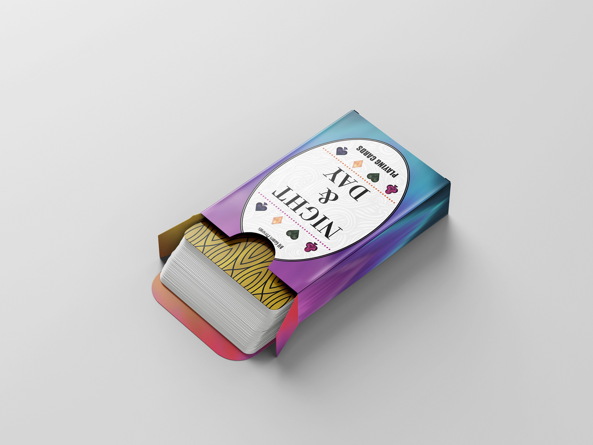

Using the theme of 'Color+Contrast' I created this custom playing card deck as apart of a weekly design project. To showcase the theme I used warm and cool colors along with custom illustrations to establish the overall aesthetic deck of card displayed.